PART TWO - PAINTING AND SHADING
Welcome to the final part of my comic creation tutorial. In this tutorial I will show how I bring the 'coloring book page' to completion. It is fun, mind numbing, satisfying, and a dark vacuum of precious life energies. As usual you will need some version of Photoshop or other and a tablet. I also briefly mention Painter but don't really go into it here.
STEP ONE - Last we left off...
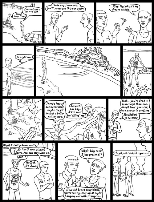
I switched to different page because it is a better example of my new technique. I play with this all the time and will probably change up what I do in the future, but I'm happy with it for this brief fragment of time, before I start wringing my hands and fainting.
STEP TWO - Fill color
This part is fun, here is where you 'color in' the coloring book. I create a new layer set as multiply, and select the paint bucket tool. I set the tolerance fairly high so it will go out to the edges better and am sure to keep contiguous and all layers checked. (This allows me to paste in the colors into a blank layer, using the linework in a separate layer. This is why in the last tutorial I stressed that you only have black lines in your linework layer.

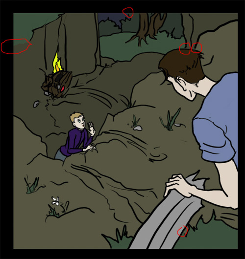
Here I've circled spots where the line art had a 'hole' that caused the paint bucket to 'overflow' if you will. You can either undo, and fix the line art if you are a perfectionist freak, or do like I do, and simply undo and switch to the brush tool and blob in some color to close the hole. Since the comic is dark these spots won't show anyway and I am, surprisingly, not much of a perfectionist.
Here is the whole page filled in. This takes longer than I expect because I always have lots of tiny little objects to fill in. I switch to the brush to clean up and hit things I missed. Oh and as I wrote in the last tutorial - if there is text that needs to be a color other than white, I select the linework layer, check 'lock transparency' and use the brush to change it at this point. (For example the motion lines below.)
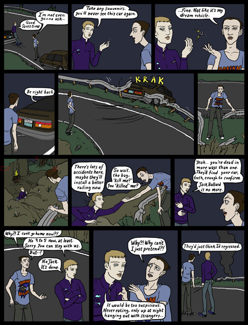
Oh also worth noting - in this stage characters always have the same colors. Jack for instance has the same eye, hair and skin color (as a vampire) that he does on every other page to keep consistency. I select these colors from the previous page.
STEP THREE - Vignette
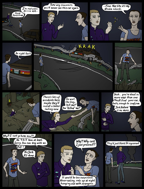
My secret trick! This adds a lot of mood to the page, and helps to create depth. I start a new layer above the color layer, set to multiply, and selecting a panel with the marquee tool, I fill in a gradient with the gradient tool. For this page, simply black to white radial gradients like an old movie vignette.
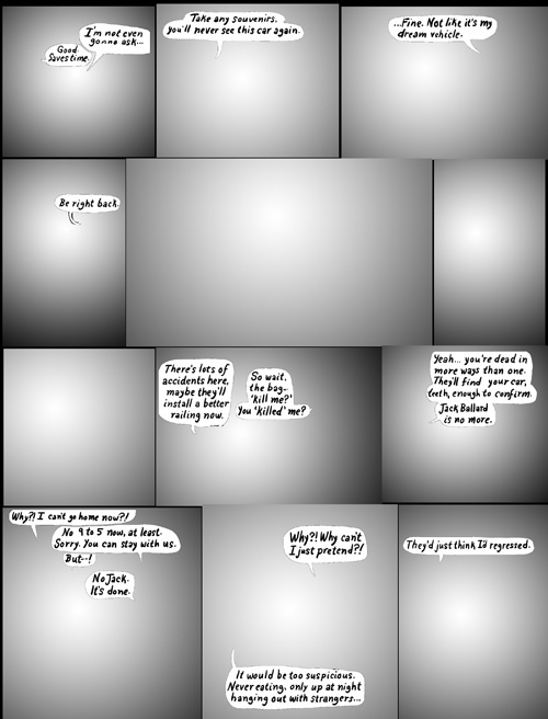
Here's what it looks like by itself. I adjust the brightness of each until I like its relative shadowy-ness. Notice I've left the word balloons out, good reason to have them on a separate layer! Sometimes I do specialty effects with this step, like light fading from top to bottom, or create a single area of shadow, etc. I'll also sometimes add a second layer of these to create an additional effect, for example radial vignette on characters, a vertical oriented gradient falling on the wall behind them.
STEP FOUR - Lighting
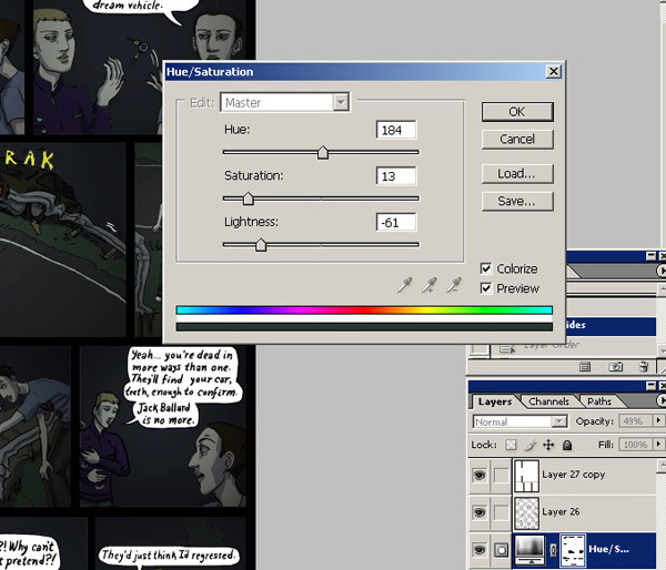
Here I set the time of day with a hue/saturation adjustment layer. See where it says load and save? When I find one I like, I save it to use again later. I've got ones for night time, sun light, incandescent light etc etc. I adjust from my setting often times but it's good to have a common starting point. Be sure to mask out the balloons or anything that isn't affected by the lighting such as glowing objects.
STEP FIVE - light and shadow
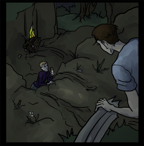
Using another blank multiply layer I use a medium gray to paint in shadow in places it would naturally fall. (Under eyebrows, between arms, under feet and so on.) I also make a layer of solid blackness, that I set to 'screen' and paint in a dark gray to be 'highlight.' (Screen seems to be strong for me so I use a very dark color at first.) This looks more blocky than this image at first, but then I send it to Painter and finesse it with their blending tools. (A subject for another tutorial?) If you don't have Painter, you can get a similar effect by setting the brush to a low opacity and just doing multiple passes. (Exactly what I used to do once.)
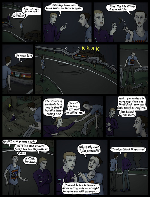
How the whole page looks with these layers.
Then I do it again with another highlight layer, and another shadow layer! I'm a madman! I can't be stopped! This phase is shockingly time consuming and inefficient but as I mentioned, madness and non stopping and what have you.

STEP SIX - Specialty lighting
My signature, and a nice fun break from the tedium of that other crap. I add in all the fancy colored lights like I was Dario Argento or somethin'. I am really interested in lighting, I've worked in 3d modeling programs as a lighter, and in high school helped light plays. It's a very useful skill for a painter. I try to imagine how light will bounce and reflect and I'm not too paranoid about accuracy, just as long as it looks nice.
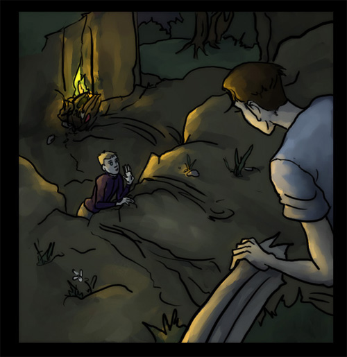
Again with a black layer set to screen, only now using a bright color instead of gray. The reason for the black layer instead of just a transparent layer is complicated and strange. It has to do with the way Painter handles blending on transparency and isn't really worth explaining until I do a painter demo. So um, yeah. Lalala.
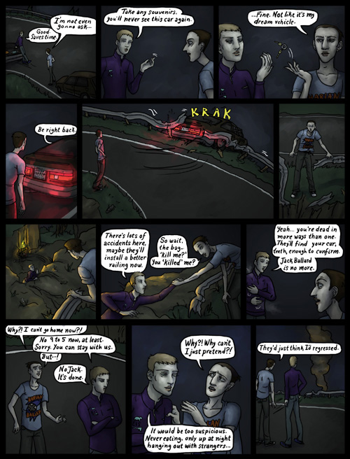
All the specialty lighting placed.
STEP SEVEN - Finishing
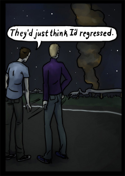
In this part I do lots of winky wonky trickery. I like to create the look of a photographic depth of field so I do something overly complicated involving recursive blurring and more layers than is healthy. I do another pass of highlights and shadows and I also do cutesy stuff like painting in little twinkle stars and freckles on button noses. Awww.
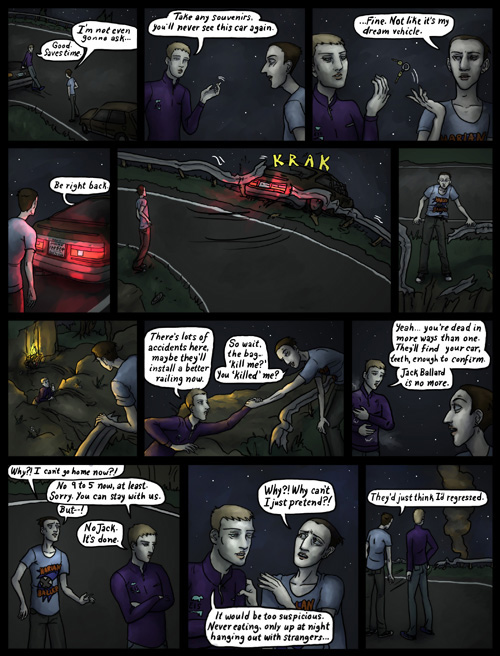
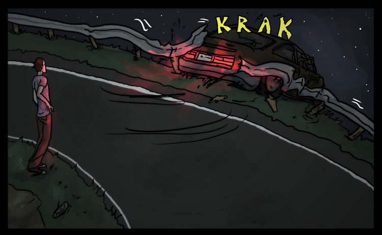
Thus, I am left with a complete page after only several hours of work! Hot dog! This is still, by far, less soul crushing than a semitraditional technique. (Which for me involved scanning, printing and rescanning probably 5 or 6 times per page.) Not to mention erasing, which is my least favorite art activity of all time.
NOW POUR A STIFF DRINK.
Hey take a look on Tumblr for an animated progression shot!
|
