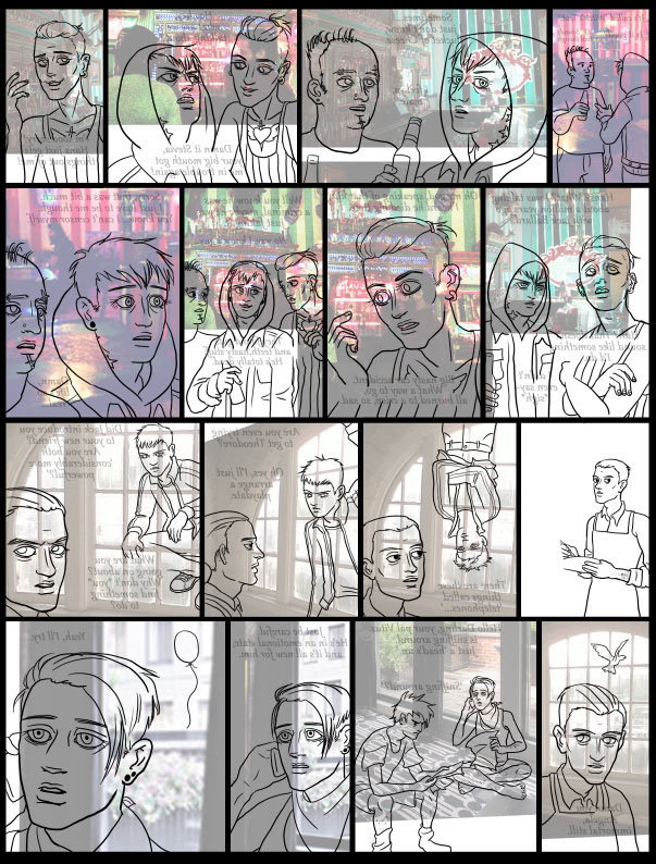
THIS PAGE IS PICTURE HEAVY!!!
I've been meaning to make a new tutorial for more than a year now, and it's finally time! I've had a few people ask for help with art, and it's a lot easier to show with pictures than with words. I'll go through my process of making the comic, explaining what I do. Now, this isn't the only way to do things, and probably not the best way, but it's the way I do it, and I hope it will be helpful to someone.
NOTE: In this tutorial series I'm going to assume a certain comfort level with Photoshop. Don't be intimidated if you don't know these, but just FYI. I do think you can find things to learn in this without knowing these but it will behoove you to know them.
Things to have: an okay computer, a wacom tablet, Photoshop or equivalent (I'm using Photoshop CS3, but it should apply to older/newer versions I think.) I also use a PC so sry Apple people, my shortcuts will be in PC terms.
Things to know: File management, layers, masks, quick masks, adjustment layers, dodge/burn, gradient tool, paint bucket and settings, rulers, how to use shortcut keys, selections --lasso/magic wand/marquee etc
If anyone has any good links for learning these, let me know and I'll add them here.
Watch below for my HOT TIPS! - These will be interesting or very specific tips, and good for our tl;dr readers.
STEP 0.5 : SET UP YOUR FILE
I forgot this step as I was creating this tutorial. In my art folder I have a 'blank' file, which I use to create all my pages. It has settings like...
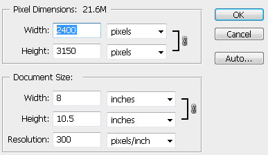
This is obviously way bigger than what I'll end up putting on the page. 300 dpi is a minimum if you plan on printing your comic, and generally it's good to draw big and then shrink down. It'll hide minor flaws like shaky lines, and make your art look nice and crisp. I wanted my comic to be standard paper size format, but you could do any orientation. Decide carefully though, if you plan on printing.
IMPORTANT TIP: SAVE, SAVE 5EVA.
I save all the time as I'm working, and as I reach a big milestone, I save a new version in case something goes wrong. Get in the habit of reflexively saving as you reach milestones like finishing a drawing, inking a face etc. Just don't flatten anything first! I usually end up with 100+ layers.
ALWAYS ALWAYS SAVE BEFORE TAKING A BREAK!!! The times I've lost work, even with my obsessive saving habit, was when I got up to get a snack or take a nap without saving, and the power went out. :( DON'T LET THIS BE YOU!
I've even had the power go out when I was on the computer. :( SAVE U GUYZ!
STEP ONE: SKETCH
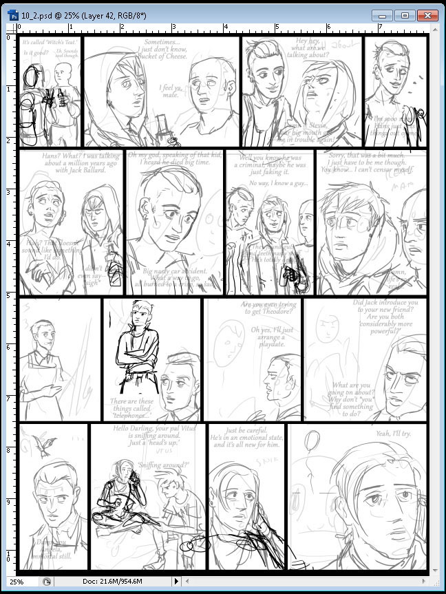
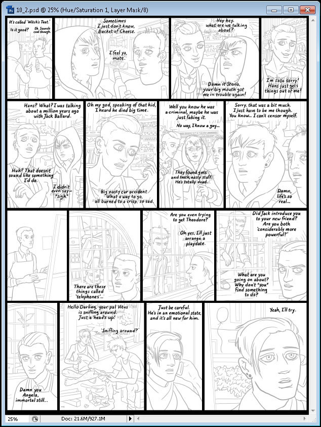
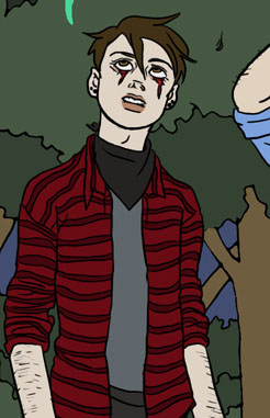
This is my example page for this tutorial.
There's a saying: write drunk, edit sober. I guess the sketching phase is the drunk part. I just try to get out my ideas without worrying about um, anything else. Try to give yourself notes, I was puzzled about WTF was going on in panel two for way too long. It was apparently my stylized way of drawing BOC's cool piercings.... o_O
I have a notepad with a very loose script of the chapter, as I like to keep fresh as I'm working and not complete too much ahead of time and get bored. I've included a few words to remind myself what's going on, as sometimes I draw these layouts weeks before I begin the actual comic.

Sometimes I'm surprised how much the finished comic will end up looking like these goofy things! Be expressive and don't be afraid to make stuff look like crap.
STEP TWO: BORDERS
I like to get these out of the way ASAP so I don't over/under draw and have it cut off by a border. My borders are always 1/8 an inch with one running along the outside, and I like to keep them simple. Some people like to do expressive, creative borders but I don't. :P
Open the rulers with Ctrl + R. You can see them here, along the edges. You can change this to percent, millimeters etc by right clicking on a ruler. I use inches because #PUTTHEUSABACKINTOAMERICA. Or something.
Click on a ruler and drag down to create a 'guide'. These are the light blue lines you see here. You can toggle them on and off with Ctrl+H. (For 'hide' if that helps you remember.)

I try to keep four rows vertically maximum. The occasional 5 row comic kills me, as I'm sure you've heard me whinge about in the posts. :) Try to not make any of the panels line up with the one above them. I offset them just a bit so you don't get a bunch of straight blocks.
Now, I use the marquee tool, and provided you have the snap setting on (it is by default), it will snap to the guides. I select the area inside the guides, and then invert the selection, and paint bucket in black. You could use a brush too, if you like.

Tada! I like doing this part early because it makes me feel accomplished. :B
NOTE: I always keep the borders on top of the layer stack, and locked so I don't accidentally draw on them.
STEP THREE: TEXT
Sometimes I put this part off, but it's good to get it done early so you make sure you have enough room for all the words. My favorite font is Gabriola, 11-13 pt, with faux bold/italic style. Find the one you like the best, make sure it's legible at your display size and keep it consistent.
I hand letter all text in the end, but this will be my placeholder, and my future template. If you are not hand lettering, you'll be basically done here but I really recommend hand lettering. I'll get more into that later.

I like to keep this fresh, so I don't pre-write any dialog. Sometimes I make a note of something for future reference. Like in the second to last panel I wrote 'snif', to remind myself of the 'sniffing around' phrase, even though I used that elsewhere. Sometimes I'll add/remove text at the last minute as I'm working but it's good to try to get it down early.
I try to keep the dialog as brief as I can get away with so I don't have to shrink drawings to make room.
STEP FOUR: REFERENCE
I like to make things easy for myself and collect some reference for things I know I'll need. I'm forever having to draw people using cell phones, but it's still tricky for me. I use sites like Getty Images and find stock images of things I'll need to draw. On the left are only part of the things I use to look at as I'm drawing, to help me. I'll flip/rotate images to get them to look more like what I'm drawing. I don't recommend tracing the images because they'll probably end up looking weird compared to your other drawings.
Get as much as you can, it's better to have too much and not use it.
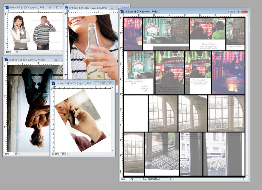
For the BGs, I collect images of locations to help me get down the architecture. I feel like it's a waste of effort to draw every background from scratch, when people really just want to look at the characters. I recommend collecting pictures of hotel rooms, as they are easy to find reference for from multiple angles. For the 'Narwhal' club on the top row, I'm using pictures of a local bar, and Jack's apartment is based on a hotel room. I use the skew/distort tools and warp the hell out of them to get them to fit, since you'll be drawing over them later. Sometimes I'll combine multiple pictures, for example later on I'll use multiple photos to create the view outside that window.
Since we aren't slavishly copying them, there shouldn't be a problem with copyright but use things like snapshots, stock photos or your own photos, rather than someone's artwork. Think about how you'd want someone to use your own artwork.
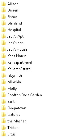
This is a look at my personal reference folder. I have locations, and pictures for characters. This is really useful when you have recurring locations/characters that you want to stay consistent.
STEP FIVE: SKETCH PART TWO
Now here is my least favorite, but most important part. xD This is the most exhausing part of making the comic, so take your time and don't burn yourself out. I lower the opacity of the original sketch layer down to almost nothing. Those drawings were goofy, but they'll give me ideas for placement and emotion. However I certainly don't want to copy their proportions!

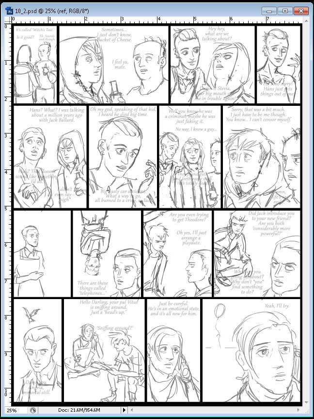
I make some decisions here, as you can see in the last panel, I changed the Minchin face to a more mysterious balloon to indicate his presence. I draw really sketchy, and use the eraser tool to make clarity out of the jumble. I've left Vitus out of this stage, since he is upside-down.
Here I draw him right-side up on another layer. Since we can't flip our 'paper' like in real life we have to rotate our image after the fact.

I got a request to talk about drawing limbs, which I am almost loathe to give any advice about as I have such a hard time myself! xD Buttt...
"HOT" TIP: DRAWING LIMBS
I don't think this gets to qualify as a hot tip, but it's a tip anyway. If you've ever looked at a how to draw book, they always have those parts where they show you how to construct bodies out of geometrical objects line cones and cubes. I am total shit at doing that kind of thing, and I think there are a lot of other artists who are too. I don't think this is the only way to draw. For fellow non-3d drawers I offer this advice:
* Do life drawing. If you can get to a school/class that has life drawing, they often have open sessions for free. Draw those naked people! Try to go when they have short sessions, you want to work quick and not slave over a single drawing. If you're stuck in a long session, get up and move around and draw the model from several different angles. One of my favorite drawing experiences was drawing Butoh dancers as they moved slowly through their poses. I burned through most of a sketchbook trying to keep up!
* Do gesture drawings. These are super fast drawings, less than 30 seconds. Try drawing people outside as your bus passes them, draw people outside your window. The faster you get at drawing, these poses will imprint in your mind, and you can use them later.
* Get reference. I use the hell out of stock photo sites, Google image search & Deviant art's stock section for reference. Get several photos of the same kind of pose, and you can mash them up to work for you. Draw the arm from one, and the torso from another. Save a picture if it was useful to you, and collect a folder of them. Be creative-- I've used reference of a baseball pitcher throwing a ball to help me with drawing a punch.
* If you have friends (not me ;_;) take photos of them in the poses you need.
* Try a mannequin. You could get one those little drawing dummies, or an articulated doll of another kind. I haven't found this to be particularly useful for myself.
* Use a mirror. I've done this a lot for particular facial expressions. Obviously you can't draw while you're in a cool action pose, but you could look at yourself and try to memorize what's going on. You could also take your own picture.
SUB-TIP-- DRAWING EARS
I advise you to just memorize how to draw an ear. There are variations in human ears, but not all that much, especially when it comes to the interior whorl of the ear. I memorized a way to draw a stylized ear that is as easy for me now as drawing a "G".
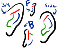
Each color is one stroke. Those ears were completely freehand in one try so they're not very cool but at least passable. xD Try doodling ears during a boring class or meeting, draw the ears of people around you. Likewise, feet don't have that much variation, and they are not very flexible. If you can draw hands, you can draw feet. They're just like, stumpy weird hands. Draw feet over and over until you feel okay about them. And no matter the trouble you have with them, you're still better than Rob Liefeld.
/"HOT" TIP
So after I complete a layer of sketching, I fade its opacity down, and start a new drawing over the top, focusing on problem areas. I do this over and over as necessary. (and it's usually necessary xD) If you're having a lot of trouble with a certain drawing, stop and find some reference to look at, and maybe redraw it.
Draw through the bodies, draw stuff that isn't even shown. I try to establish where Jack's shoulders are so I can place his arms.
HOT TIP:
BAD DRAWINGS
Sometimes you have a drawing that you just can't get through. Maybe you hate how it looks, and you don't even know why. Maybe you're having an unreasonably hard time drawing in general that day.
STOP DRAWING!
Possible causes of mysterious bad drawing syndrome : tiredness, sore arms, low blood sugar, bad day, depression, bad underlying sketch, uncomfortable chair/desk
Assess: do your arms/ hands feel tired? Are you sleepy? bored? frustrated?
It's surprising how many times I've had a horrible go at drawing, and discover my arms are all cramped up.
Potential solutions:
rub arms, take a nap, eat a banana, stretch,
make sure the temperature & room is comfortable,
take a shower, take a break and do something else, play good music with headphones,
warm up with easy drawings - letters etc,
do more sketching, use a bigger brush,
zoom out while drawing,
flip drawing, get more reference
Common mystery problem -- bad hairline/top of head shape, ear is too low too high
Sometimes it's easy to forget how much the general shape of the head contributes to likeness. Pay special attention to these areas if there's something wrong with a drawing.
Nothing works?
Are you sure it's bad? Take a break and come back to it. I've gotten totally hopeless about a drawing, gone to bed, woken up and forgotten what was supposed to be bad about it...
LAST STRAW:
Fix it in post? - Can you worry about it later? Warp and skew it into position? Is it even an important drawing?
Erase and start over.. If it's early on, consider this one sooner. Sometimes it's the only way. :(
/END HOT TIP
Morreee drawing. I draw in Karl's/Stevia's tattoos, get Vitus in there etc.
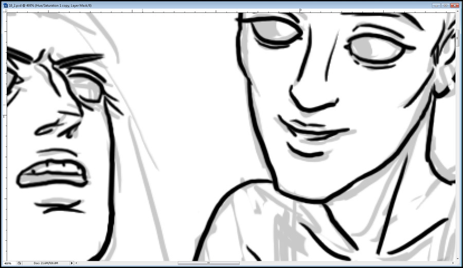
At this point I flip the canvas. In IRL drawing, this is equivalent to holding up your paper to the window. You'll find all kinds of problems when you look at something a different way. In the drawing below you can see how I'm fading the layers below with an adjustment layer. It's a Hue/Saturation adjustment set to lighten, and then I can change the opacity to lighten the layers beneath. Or you could just change the opacity manually. :P
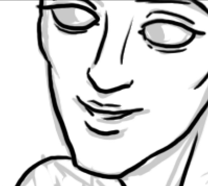
I'll actually work with the image flipped until after the inking.

Keep sketching until you're reasonably satisfied. Try using the distort/scale tools to get things how you want them. The drawings can be loose and messy, as long as you can see what you're doing when you're inking.
STEP SIX: THE INKENING
Now that our sketches are flipped, and lightened, we can begin 'inking.' This will create neat lines for you to color later, and make a crisp, smooth appearance to our drawings. In IRL comics, you'd use.. y'know, ink. For my inking purposes, I just use the default brush tool, set to a size 8 on average, going down as low as a 5 for tiny details.
I keep my free hand on the 'ctrl-Z' keys, and use them frequently.
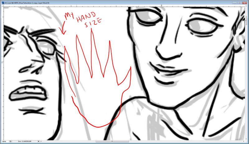
I ink zoomed in reeeeeeally hard. This is about half scale of what's on my screen.
This is more like what I'm actually looking at. :B
Also, my monitor is huge. For scale, this would be my hand size on the monitor, and my hands aren't the tiniest...
(Btw my fingers don't actually come to stabby points.)
So I go through and ink the faces first, typically. The bodies and limbs can go whereever, but the faces are the focus. Also it will urge me on to finish the crap work like drawing arms and legs. :P
Then I ink the stuff I don't want to ink as much, and stuff that's in the backgrounds. Anything that goes behind something else gets on its own layer. By the way, note that I am not drawing the irises in character's eyes.
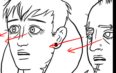
HOT TIP:
EYE CONTACT
Draw the irises on their own layer. It's critical to have characters really look like they're focused on what they're supposed to be looking at. I get in there and move the irises around pixel by pixel until they look right. The closer they are to what they're looking at, the more 'cross-eyed' they'll be, and if they're spaced out their irises will be farther apart. Usually people make eye contact with one another if they are in a conversation, unless they are lost in thought or lying...
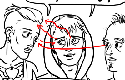
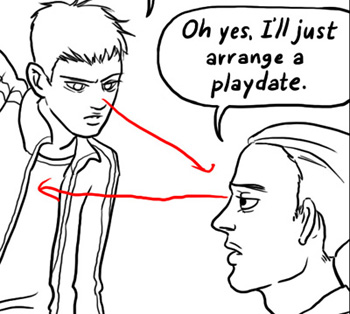
Here, Stevia is totes serious about Jack being dead, so they are looking at Karl directly. BoC is watching Stevia in discomfort. Karl is trying to casually lie, so he's gazing off a bit, though sort of looking in Stevia's direction.
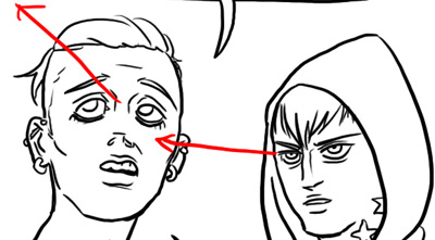
Here Stevia is telling a comically outrageous lie, so they can't even look in the ballpark of Karl. Karl meanwhile is making direct contact with as much of Stevia's face as he can see.
Here Karl and BoC are in shock at Stevia's words, and stare at them, or at least where you'd imagine they were because Stevia is off panel.
Demetri isn't lying here, but he doesn't want to face Vitus straight on. He gazes somewhere around Vitus' shoulder. In a tense conversation, making direct eye contact seems really aggressive, and that is exactly what Vitus is doing here.
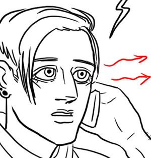
Here Jack is talking on the phone, so he doesn't have anyone to look at. He's focused on the words, so he gazes out into the distance as he listens.
Putting effort into where your characters can looking can add a lot of emotion to your story, and say a lot about what the character's feelings and intentions are, without having to tell your audience.
/ HOT TIP
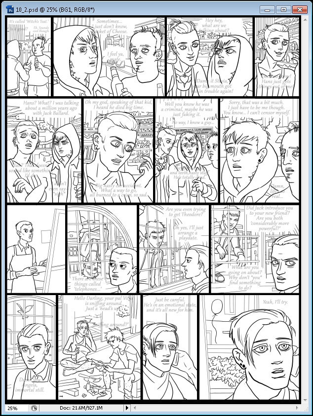
So here are all the layers together, yay! We've finished the bulk of the hardest work on the comic!

HOT TIP:
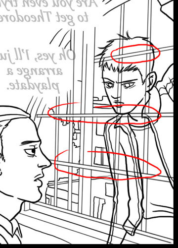
TANGETS: VORTEXES OF EVIL
So let's say you're inking something, and there are always lines that have to go behind other lines. Let's say, your character in front of a background, or in this example, the place where Jack's bandana, shirt strap and shoulder meet with his chin.
(This is a fake example, I usually catch these before I do them, thankfully. :B)
 
See how the three lines all converge, and hit the corner of his chin? It might not look like a big deal, but it looks weird zoomed out, and draws the viewers eye in LIKE A VORTEX OF EVIL! This can make the drawing hard to read. This can be an even bigger problem than looking weird if it causes a problem reading your character from the background. This is an especially bad problem for line art comics with no color or shading to help the reader.
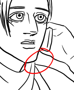 
Here I've 'fixed' the problem, by offsetting the lines so they don't all intersect at one point. The kerchief wraps around the back of his neck, the strap of his top goes over his shoulder and the line of his shoulder goes to his back. Keep an eye out for these as you're inking, especially as you connect lines.
/HOT TIP
STEP SEVEN: BACKGROUNDS
I am probably weird in that I actually like drawing backgrounds. Particularly organic shapes like trees can be fun and relaxing. Sadly for this comic we've got striped-ass walls and window panes. SIGH.
So we turn on the reference images we gathered lo those many hours ago. They'll probably look weird and out of perspective to the drawings you've done by now. Oh well. You can distort them to fit again, or do like I usually do and just take them as suggestions. :B
HOT TIP:
DRAWING A WINDOW FRAME IN FRONT OF A CHARACTER
I need to create the bars of the window that are passing in front of Vitus. I draw right over the top of Vitus, making straight lines by clicking the brush at one end, and clicking at the other holding down control. This will draw a straight line between the points. If you are drawing a 90 degree straight line, you can also hold down shift as you're drawing and it will lock you to a straight line. So first I draw the vertical lines.

Now I do the horizontal lines on another layer. If I need to adjust the perspective layer, I will apreciate having these seperated. BTW I do this same technique for drawing a striped or plaid shirt!

Now I draw the background view on yet another layer, and complete the window frame.
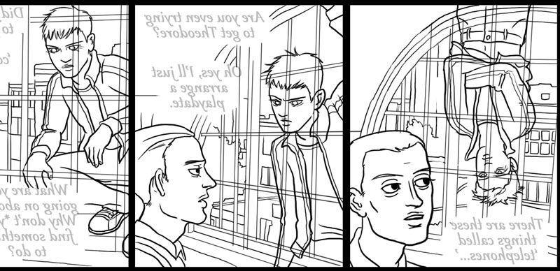
On something like a window pane, some of the bars are going to cross over the top of the other bars. This keeps things from looking like a flat grid. I go in to the vertical bars layer and mask out the parts that go behind the others. This is another reason to draw things on separate layers. Later I will mask Vitus out the same way.
/ HOT TIP
Here's everything after I've drawn in the backgrounds, masked out everything and flipped it back the right way.
STEP EIGHT: LETTERING
Get some good music on, because this part is tedious as fuck.
I lighten everything but the borders, and get in there and draw over the text with my own lettering.
 . .
An example of how this looks on my screen:

You may ask, 'but why? Couldn't you just type it in? Why letter by hand?' I feel that the hand written lettering has a much warmer feel than the computer font. It matches up better with the drawn characters, so it feels like they're really 'saying' something. I've seen some hyperrealistic comics where the text balloons feel like they're post-it notes stuck on an oil painting. Hand-written text can also be more expressive. I can 'bold' parts that I want to, and warp them to fit to my panels perfectly. I really recommend hand-lettering to add a nice, humane touch to your art.
/soapbox
Also, it's kind of fun to hand draw different fonts. I had fun copying Comic Sans the other day. :)
STEP NINE: BALLOONS
This part is also tedious, but at least it's somewhat fast. This is the part that really says 'comics' to most people.
Some artists use fancy templates and junk, but I don't care about anything by this part of the process. xD I just free hand ovals around the words, and then erase a hole and draw in the spout. As ever, this is on a new layer. I think it's okay if they're a little wonky, they'll even out when you shrink them. I really like to use this opportunity for expression. The third and second to last panels have a 'digital' balloon to show that the words are coming from the phone. Sometimes I make a balloon shaky or spiky to portray the way it's being spoken. Another benefit to not using a template!
Btw I don't have any rules for when to use that hourglass shaped balloon like in the last panel in the third row, just when I feel like it. I think it's good for breaking up a paragraph and reduce the size of a balloon.
A frequent error that I run into, is accidentally drawing the balloons on the text layer. Try locking the text layer if this comes up a lot for you. I usually rearrange the text as I'm drawing the balloons, so I leave it unlocked a lot and I screw it up. :x If you do screw it up, just copy the offending layer, and erase the text out of one, and erase the balloons out of the other. and SIGH
Now I hide the lettering and everything else except the balloons and the borders, and set up another layer behind the balloons. I select the paintbucket and use these settings. This is why I draw them on another layer. I select these options: ('all layers' is the important one) and I paintbucket in white. You might get bleed over into the panel, in which case you'll need to go close the 'hole' in the outline layer. If you have a balloon that goes over the borders, you'll need to rearrange things so the borders are not on top, and draw in that part manually. That doesn't come up much for me.
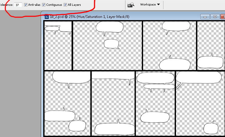
Here's everything all together. The filled in balloons hide the background, and everything looks nice and coloring-booky!

Speaking of coloring booky, that ends this installment of my tutorial, and the next will be coloring!
If you get this far in your comic, congratulations! This is the hardest part for me, and takes me between 10-20 hours. More if there are more characters, and if there are five rows... forget it. x_x
Thanks for reading, and if you have any requests/comments etc please let me know on the main page!
...
BUT WAIT--!!
HOT TIP SUPER SPECIAL BONUS ROUND!
DRAWING PLAID
This is cheating a bit, as this panel is not in this page, and it dips into coloring just a bit but I want to do it before I forget! Drawing plaid is time consuming, but I think it is fun and looks cool. You can use these same techniques for drawing a striped shirt too, just leave out the second layer of stripes.
STEP ONE:
Here's our blank canvas of a shirt. Jack has his sleeves rolled, and pushed up a bit.
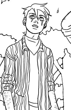
STEP TWO- Draw in vertical stripes on a new layer. Follow the form of the cloth. I offset the lines where they would cut off, like the cuff of his sleeve, or as they curve into a deep wrinkle. Think about the seams of the garment, like at the shoulders. Most shirts don't perfectly match up the patterns at these places. For plaid, don't make the lines equidistant, keep a slight gap between them.
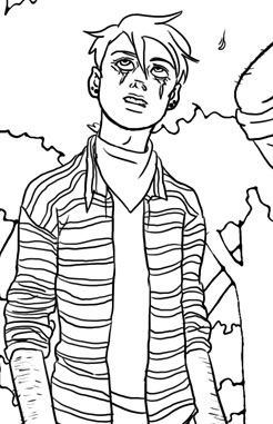
STEP THREE: I've hidden the other stripes, and I draw the horizontal stripes on a new layer. Try to keep them the same thickness as the previous stripes.
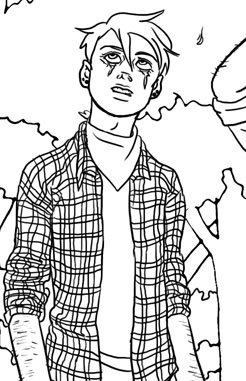
Here they are together.
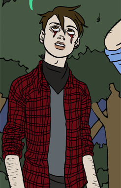
STEP FOUR: I laid down the basic red color for the stripes. Keep in mind my color is on its own layer, behind the line art. I can hide the stripes when I use the paintbucket so I don't have to arduously fill in each little stripe.

STEP FIVE: I hid the horizontal stripes, and paintbucket-ed in the darker color on its own layer set to 'multiply.' This will darken whatever is beneath.
STEP SIX: I hide the vertical stripes and do the same step with the horizontal ones, painting in the stripes on their own multiply layer.

Now I turn all the layers on. The places they cross will automatically be darker, and we have a nice plaid! If you want, you can keep adding layers of color on top of each other to make a more fancy plaid, but this is a good basic red plaid.
/END HOT TIP! |

